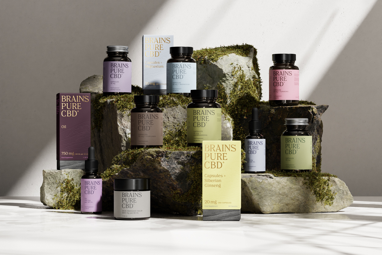

When Brains Bioceutical approached us, they had something few other CBD brands could claim: EU-GMP certified cannabinoid manufacturing facility operating at scale, with over 30 clinical trials supported and 600+ commercial pharmaceutical batches produced. But they faced a paradox. In a market flooded with thousands of CBD brands making dubious claims, how do you communicate genuine pharmaceutical-grade quality without alienating the everyday wellness consumer? The challenge was to translate their unparalleled scientific credibility into a consumer brand that could compete on the shelf while maintaining the integrity that set them apart.
Our strategy was rooted in a simple insight: quality speaks for itself, but only if you give it a voice. Rather than shouting about certifications and clinical trials, we let the product and design do the talking. The brand needed to feel approachable and aspirational while subtly signaling its pharmaceutical pedigree. This meant creating a visual identity that was clean, confident, and unmistakably premium, one that could hold its own at Harrods while remaining accessible to the mass market.
We developed a comprehensive brand architecture that could flex across multiple contexts: from trade show booths at the world's largest pharmaceutical conferences to influencer campaigns and retail packaging. The design system needed to work equally well on a supplement bottle, a beauty balm, an event backdrop, and a co-branded partnership. The unifying thread was a commitment to restraint, clarity, and an obsessive attention to detail, values that mirrored the brand's "Made Better" philosophy.
The color-coded product system allowed for intuitive navigation across a growing product line, while the minimalist packaging design ensured that the brand would stand out on crowded shelves not by being louder, but by being quieter and more refined. Natural textures, pharmaceutical-grade typography, and a muted earth-tone palette communicated both wellness and scientific rigor.
We delivered a complete brand ecosystem that spanned every customer and stakeholder touchpoint. This included product packaging for the UK and USA supplement lines, a beauty product range, PR materials for campaigns and in-person events, booth designs for the industry's most prestigious pharmaceutical trade shows, and branded assets for sponsored events and influencer partnerships. Each element was designed to reinforce the brand's core message: in a market where quality is often an afterthought, Brains Pure is made better, from every ingredient to every detail.
The result was a visual identity that could seamlessly transition from a clinical trial presentation to a wellness influencer's Instagram feed, always maintaining the same level of sophistication and credibility.
Brains Pure has established itself as a category leader in the regulated CBD market, leveraging its pharmaceutical infrastructure to capture value in an industry where regulatory barriers are rising and consumer expectations for quality are higher than ever. The brand secured UK Novel Foods approval and submitted for EU EFSA authorization, creating defensible competitive advantages that few competitors can replicate. Strategic partnerships with Vitabiotics, the UK's leading vitamin company, and premium retail placements at Harrods validated the brand's positioning, while mass-market distribution ensured accessibility.
By creating a cohesive visual identity across all touchpoints: from trade shows to retail shelves to influencer campaigns, we helped Brains Pure communicate a singular message: in a market of thousands, only one brand delivers pharmaceutical-grade quality at every level. The work didn't just differentiate the brand; it redefined what consumers should expect from the CBD category.