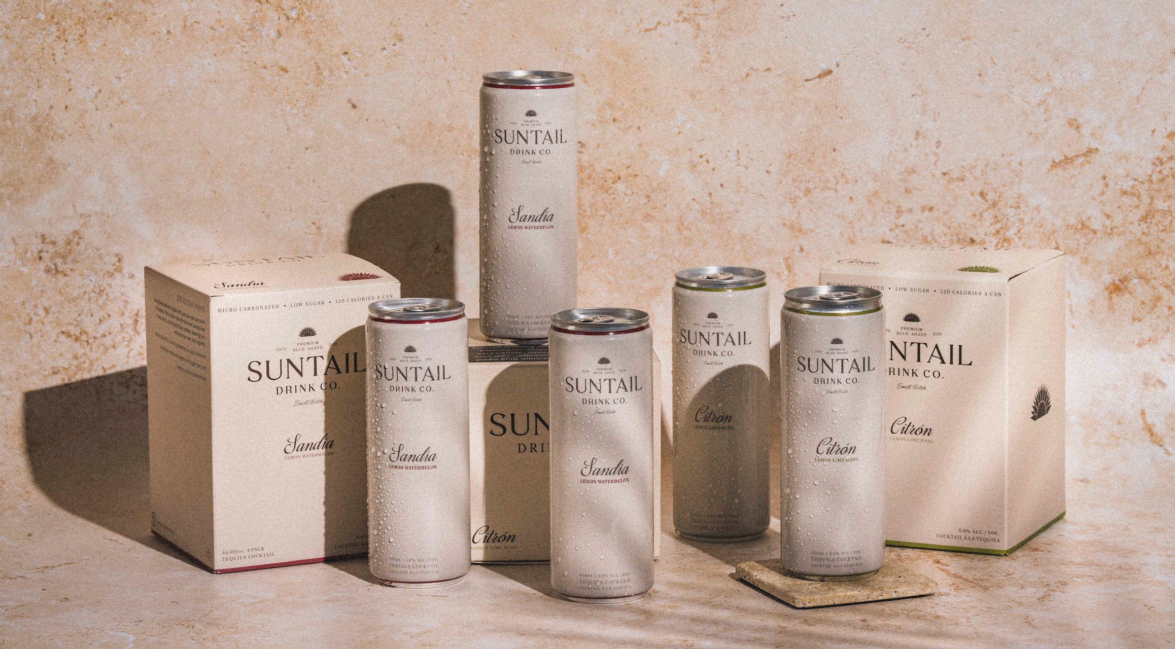

Suntail Drink Co. approached us with a powerful name and a bold ambition: to create the next industry-leading tequila RTD. The client had a vision for a premium brand with the minimalist appeal of Apple, but their initial concepts were fragmented, leaning towards bright, loud colors that clashed with that sophisticated positioning. The challenge was to distill their ambition into a cohesive, market-defining brand identity that could cut through the visual noise of a crowded category and establish Suntail as a premium player from day one.
In a market saturated with brightly colored cans all vying for attention, our strategy was one of sophisticated restraint. We chose to create a brand that felt like a discovery, not an advertisement. This meant deliberately moving away from the loud, ephemeral trends of the RTD category and anchoring the brand in a timeless, luxurious aesthetic. The core insight was that true luxury doesn't shout; it whispers. The goal was to create packaging so elegant that customers would be proud to display it—on their Instagram feeds, their kitchen counters, and in their refrigerators.
This philosophy informed every decision:
Color Palette: Extensive market research and trend analysis pointed towards a palette that balanced warmth and sophistication. We selected a rich chocolate brown as the primary brand color, paired with a soft cream. This combination evokes a sense of earthy authenticity and refined luxury, setting it apart from the artificial brights common in the category.
Iconography & Naming: The name "Suntail" was meant to convey sun-drenched momentum. We translated this into the brand’s core icon: a stylized sunburst that is also an agave plant, the source of the product's premium tequila. This created a simple, powerful visual story. To build a unique brand world, we established a proprietary naming convention for the flavors. Instead of generic names, we chose "Sandia" and "Citron"—an elegant, ownable language that, like ordering a "Grande" at Starbucks, signals you're part of the brand's world.
The result was a comprehensive brand identity system that exuded quiet confidence. From the elegant serif typography and minimalist packaging to the aspirational lifestyle photography, every element was designed to communicate premium quality and effortless sophistication. We delivered a full suite of assets, including brand guidelines, packaging design for cans and boxes, and art direction for all physical and digital assets. Our role extended to supply chain coordination, ensuring the premium vision was executed flawlessly in production.
The market's response was immediate and overwhelming. Suntail's pre-launch buzz, fueled by its distinctive branding, led to a launch that shattered all expectations.
• Explosive Launch: The launch party venue, anticipating 150 cans sold, sold over 800 cans in a single night.
• Rapid Retail Velocity: The brand secured over 100 store listings within months of launch, with many stores reporting they couldn't keep the product on the shelves and started waiting lists.
•I ndustry Acclaim: Liquor store managers and industry insiders began citing Suntail as "the next big thing in tequila," recognizing its potential to disrupt category leaders.
• Premium Partnerships: The brand quickly became a staple at high-end venues like The Parlour Vancouver, Moxies, and Greta YVR, and was adopted by leading event companies like Blueprint Events.
By translating a scattered vision into a disciplined, strategic brand identity, we helped Suntail Drink Co. not only launch successfully but establish itself as a formidable new leader in the premium RTD market. The brand's success is a testament to the power of strategic branding to create tangible business momentum and overwhelming market demand.